Exploration 12 -
I decided to perform my investigation using the Microsoft Excel function available for free online for two reasons. The reason for this is that I want to ensure that I am using tools in the classroom that all of my students have access to. I cannot always assume that my students own or have access to computers that contain the program, so I wanted to use a tool that anyone with a computer connected to the internet can utilize. I also like using the google document tools online so students can directly submit questions and homework assignments to me online with these tools.
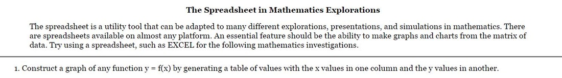
I began my exploration by using Microsoft Excel on Google Docs by exploring the graphs of functions in the form of y=f(x) by generating function value tables (part 1 of the exploration).
Before getting into the exploration, let me first discuss how one actually plots a graph in excel using plotted points. To begin with, one must create a table of x and corresponding y (f(x)) values in excel by plotting points or writing a function. I have included all of my plotted tables in each example.
After this step, one must select the entire set of table values and insert a chart in Excel. The scatter plot chart should be selected and one will be able to see each point contained in the table set as a plotted point on the graph. From here, one must go into the customized settings and select the most appropriate value for the “Trend line” field. The options include: linear, exponential, and polynomial, so one must know the type of equation they are plotting (if it is even one of these options. The function grapher will also have to change scale and display settings to obtain the best view of the graph. Overall, it’s not as intuitive as other available graphing software. It also has limitations on the type of equations that are plotted correctly, as you will see below. One will also need to accurately plot enough points to plot a non-linear function, as Excel uses a formula to determine the line of best fit for the plotted points based on the equation type selected.
As one needs to understand scaling and know what equation they are plotting in the process of creating a chart, it is safe to say that Excel is probably not the best tool for students to explore equation formats that they are not familiar with. While it allows for students to create tables and plot points, it does not do much beyond what a student could perform by hand in this arena. Where excel is more useful is calculating table functions values for a large data set. But I digress from my exploration.
The first function I looked at was linear in the format of y=4x+2 as depicted below:
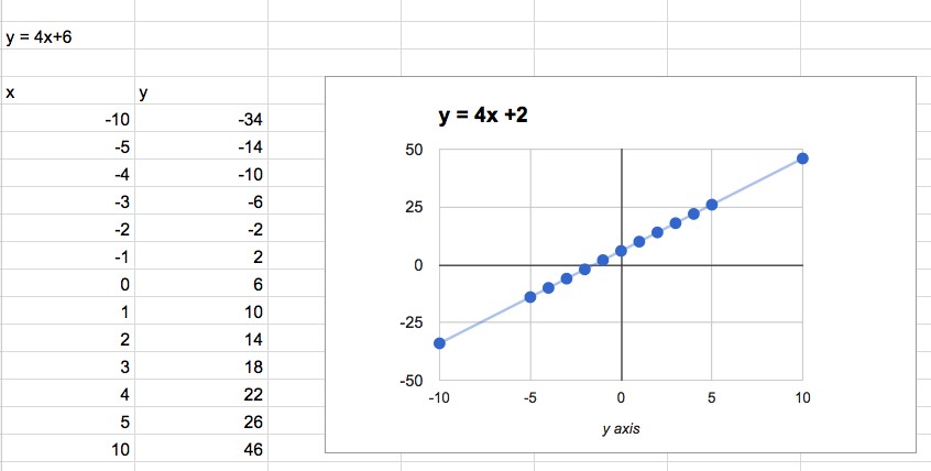
As you can see, excel accurately plotted a linear trend line which it does by calculating a line of best fit. I cannot find an accurate resource of the exact way that excel does this, but I presume that it is not performed using it’s regression algorithm as I see later in my exploration.
This isn’t really providing much value in a lesson on linear graphs, though. I can construct linear graphs by hand by just plotting two points. Perhaps it would be a nice tool for estimation, but I think one could still do this by hand as quickly as they could in Excel.
After plotting a linear function, I decided to move on and graph a quadratic equation using the polynomial trend line for the function f(x) = x^2:
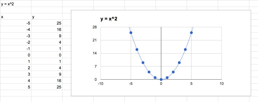
As you can see, I have plotted enough points and Excel accurately plots the trend line. I could again perform this action by hand, but at least the accuracy of the image allows me to estimate points on the graph a bit faster?
I moved on to a trigonometric function f(x) = 4 sin(x/2) to see how Excel would handle it. I made sure to include a nice spectrum of points to give the application a fair chance.
I moved on to a trigonometric function f(x) = 4 sin(x/2) to see how Excel would handle it. I made sure to include a nice spectrum of points to give the application a fair chance.
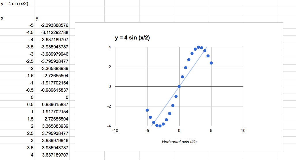
But alas, despite having a function to calculate the sine, no trend line option provides an accurate graph of this function. So, do NOT use excel for exponential functions as it will provide no value whatsoever. It is also key when plotting a trigonometric function to plot enough points to see the full sample of the function. Even here I did not go far enough to obtain a full phase of the function. Exploration of trigonometric functions via a table only really makes sense to those that understand the nature of the trigonometric function already (and if they do, why are they exploring it?). I would suggest other tools to observe the manipulation of data to explore the form of trigonometric functions (I would also use the unit circle in that discovery.).
In short, Excel with trigonometric function is a complete waste of time. I hear that the rounding on these functions can be a bit tricky as well, so if you see Excel in a trigonometric lesson plan, run. Run very, very far away.
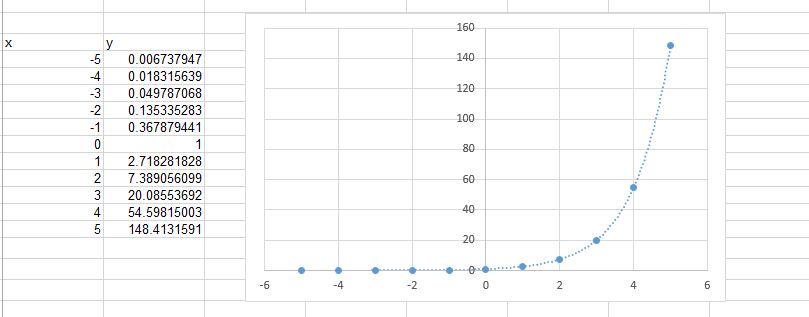
My last exploration was of an exponential function, f(x) = e^x to test the trendline capability for exponential function. Yes, the trend line was accurate, but I again found myself worried about potential rounding issues with Excel calculations. I also didn’t see value in exploring exponential functions with a charted table. Using other tools that allow slider manipulation of equation types while producing a set of table results seem to be more valuable to student exploration. While excel works in many cases, it simply takes TOO long.
In short, Excel with trigonometric function is a complete waste of time. I hear that the rounding on these functions can be a bit tricky as well, so if you see Excel in a trigonometric lesson plan, run. Run very, very far away.
My last exploration was of an exponential function, f(x) = e^x to test the trendline capability for exponential function. Yes, the trend line was accurate, but I again found myself worried about potential rounding issues with Excel calculations. I also didn’t see value in exploring exponential functions with a charted table. Using other tools that allow slider manipulation of equation types while producing a set of table results seem to be more valuable to student exploration. While excel works in many cases, it simply takes TOO long.
Though, I do see a need to teach excel skills and functions in the classroom, as they are used so much in the business arena, and I see so many of my peers who lack the ability to perform data analysis in the classroom because of this, even after a college education. There are some excel tasks that are good for the classroom. For instance, the following exploration was easy to perform in excel, and excel enhanced the task as it allowed students to quickly perform operations and see patterns. When spreadsheets are used to quickly calculate large amounts of data and allow students to stay on task to the actual lesson of the day, they can be a powerful tool.
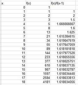
You can see in the first sequence (part a) that the sequence approaches the golden ratio!
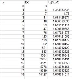
It even does when you alter the integers in part b! Now you can spend more time with students discussing the mathematics and why this occurs with this sequence, rather than performing computation.
Here is a link to my Excel file of these explorations:
| exporation12.xlsx |
Here is a review and critique of one of my favorite spreadsheet problems in the classroom:
Mathematics Teacher Article/Excel File for Activity:
Mathematics Teacher Article/Excel File for Activity:
|
| ||||
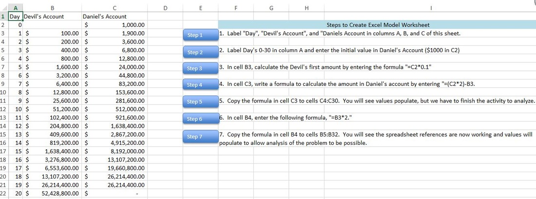
The article, “The Devil and Daniel’s Spreadsheet” reviews how to implement a classroom activity that first uses referential formulas in Excel (what the article refers to as symbolic spreadsheets) to solve a math problem from an algebra textbook by Burke released in 2001. I have outlined the problem and solution via excel macros in an attached file.
After reviewing the initial problem, the article suggests using tools such as the TI-Nspire CAS (computer algebra software) calculator to attempt to understand why the outcome of the spreadsheet occurs by exploring graphs of the functions generated by the problem. Students are challenged to use graphs, ratios, and table data to attempt to write an explicit formula to model the problem situation. Students are then asked to propose a counteroffer of the situation that will actually benefit Daniel by using graphs and manipulating their original spreadsheet (changing formulas, exploring ratios, etc.).
The Common Core standards detailing mathematical modeling are vague, disconnected, and do not provide solid examples of how to implement tasks effectively in the classroom. While the standards provide examples, they do not do enough to define what mathematical modeling is and looks like, nor do they detail good ways to implement problems in the classroom using tools and technology. I thought this article very nicely discussed a problem on recursion and how students could use technology to effectively understand/answer the problem. It was a great example of what mathematical modeling was and encouraged to allow student exploration without too much scaffolding.
Symbolic spreadsheets and CAS software has received no representation in teaching tasks because of availability in the classroom, but this has changed with graphing calculator prices/availability and free online software such as Geogebra and Google Docs. The article points out that these tools can move a student from engaging, “with mathematics as an experimental discipline that moves from examining many individual cases to reasoning with general patterns, including recursively defined functions.” This article outlined very nicely how the calculators we used in class this week could be used enhance a task on recursion.
I also enjoyed a different format of teaching recursion in the classroom that emphasized the use of spreadsheets and graphing tools in the classroom. So often I see task plans that emphasize writing out tables to attempt to discover patterns, when this is a perfect example of how technology can enhance the discovery and discussion. In this problem, students are pushed to define why the original problem does not work to Daniel’s favor in many different formats. They are also pushed to define and model different scenarios that Daniel could counteroffer, which can occur as the technology has provided more time for students to perform further discussion and analysis on recursion. I like that the article mentions that they are not just answering the problem question, but pushing students to meet the standard of understanding why the problem works as it does and how linear and exponential functions differ. The methodology also allows students to be creating and have choice in problem resolution which is what modeling is all about.
I am excited to attempt this problem in my Accelerated Coordinate Algebra course next year. After performing some research, I found another teacher (Kevin Watson) who wrote about implementing the problem in his classroom. (https://sites.google.com/site/kevinsawesomemathsite/home/mathed‑308-notes-and-assignments/mthed-308-reflections/reflection-on-tdads). After reviewing his critique of the implementation, I would change the following items in the task when implementing in my own classroom:
·It is clear from the review that overall discussion questions need to be clearly outlined for students. I like that Kevin added in questions such as “Why does Daniel’s value get to $0 at one point?” I might pose that to students to answer in discussion after discovery.
· It is also clear that defining how to use certain features in the technology being used is needed in the activity. While I want to ensure that teaching features does not give the task away, it is not safe to assume students know how to use the technology. I find that students struggle with using Excel effectively as these skills are no longer taught in the classroom.
REFERENCES:
Burke, M. J. (2012). The devil & Daniel’s spreadsheet. Mathematics Teacher, 105 (8), 579-585.
Watson, K. Reflection on “The devil & Daniel’s spreadsheet.” Retrieved from https://sites.google.com/site/kevinsawesomemathsite/home/mathed-308-notes-and-assignments/mthed-308-reflections/reflection-on-tdads